Examples of our audits
This is what a subscription gives you. We capture whole journeys across apps and audit them against UX and behavioural science principles — screen by screen, what works for the person using it and what does not.
Across apps we also know what is table stakes and what lifts an experience, so you can read a whole journey aggregated rather than one screen at a time.
Every screen we audit is recorded the same way: what is on it, what it was meant to do, what the person in front of it actually felt, and the established principle behind that. Here are eight of them.
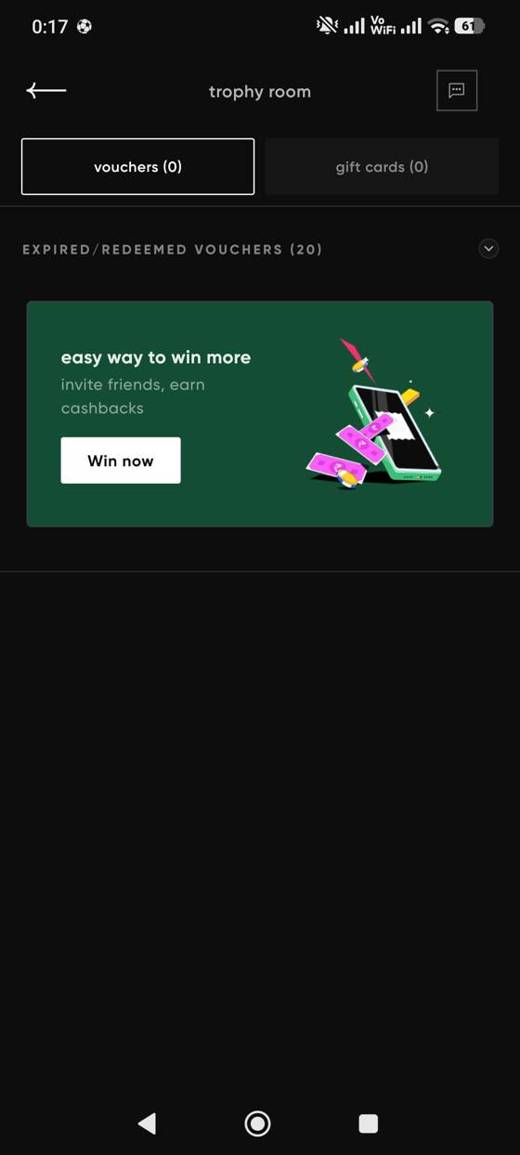
A trophy room full of expired
A rewards page. Vouchers: 0. Gift cards: 0. Expired: 20. Under it, invite your friends.
Meant to feelYou have rewards waiting. Come and spend them.
Actually feels“Twenty expired. Right. And now you want my friends.”
Loss aversion. Losing hurts about twice as much as winning feels good.
FixLead with the ₹125 she already has. Put the 20 expired under history.
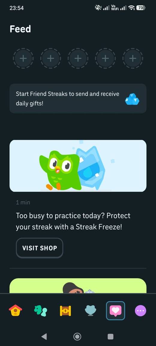
Sells the cure for its own trap
A Streak Freeze for sale in the feed. Her streak is already at zero.
Meant to feelProtect your streak. Don't lose your progress.
Actually feels“I don't have time today. But I'll lose everything.”
The streak is worth nothing on its own. It was built so that losing it would hurt — and the fix is for sale.
FixFreeze it for free. 'Busy today? We've frozen your streak. It'll be here tomorrow.'
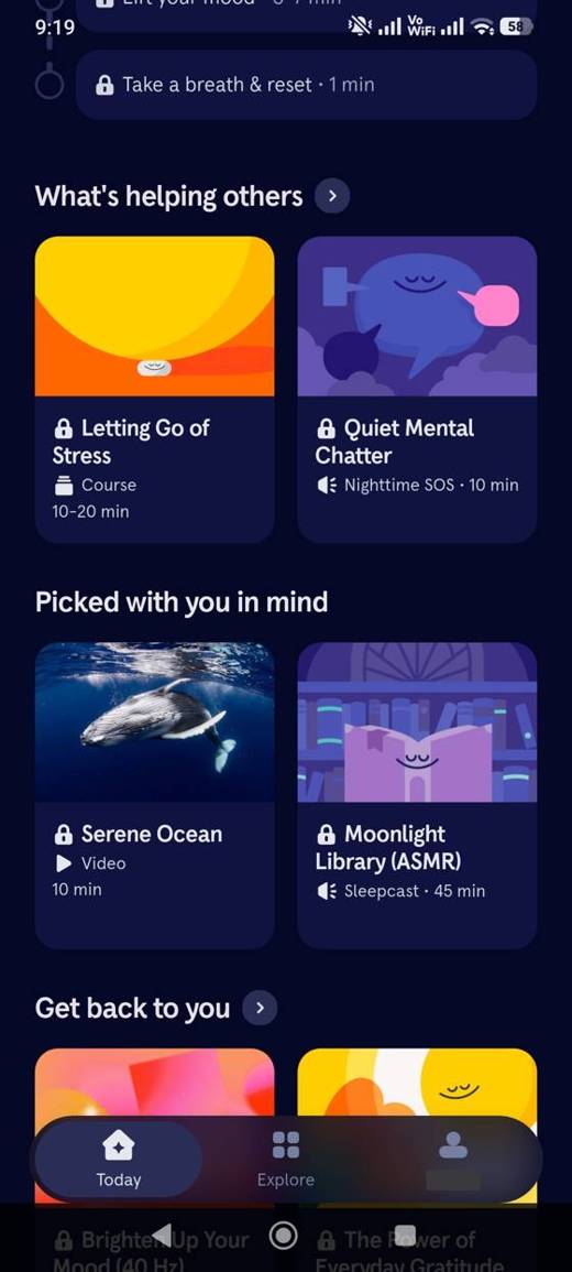
Everything locked, nothing free
Ten of ten things on the home screen are padlocked. Nothing is marked free.
Meant to feelSubscribe and all of this opens.
Actually feels“So there's nothing I can actually do.”
A padlock means 'this one is paid' only while some things are open. On a wall of locks it means 'this app is paid'.
FixOpen one meditation a day and the one-minute breath. Mark them free.
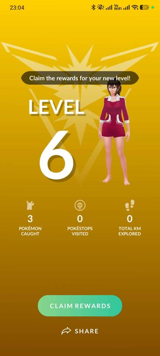
A level-up for doing nothing
'Claim the rewards for your new level!' Underneath: 3 caught, 0 stops, 0 km.
Meant to feelYou levelled up. Well done.
Actually feels“Level 6 for catching three things?”
A reward for doing nothing tells you what the next one is worth.
FixSay it plainly: 'Levels have changed — you are now Level 6.' No confetti, no share.
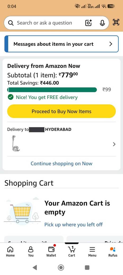
The bar says the number
A full green bar, a tick, and ₹99 printed at the end of it.
Meant to feelYou've got free delivery.
Actually feels“Ninety-nine. So that's the line.”
A number she can check beats a cheer she cannot. Now she knows the line for next time.
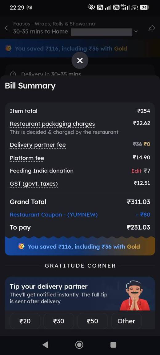
Says the whole tip goes to him
'They'll get notified instantly. The full tip is sent after delivery.'
Meant to feelTip your rider.
Actually feels“Does he actually get all of that?”
Everyone wonders if the app keeps a cut. This says it does not, before she has to ask.
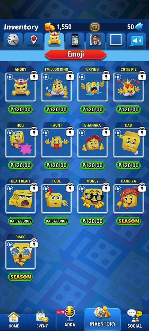
Every lock says how to open it
Fifteen locked emojis. Each one says how to get it: ₹120, daily bonus, or season.
Meant to feelHere is what you could have.
Actually feels“The foul one comes from daily bonus. The disco one is season. The rest are ₹120.”
A lock is information when it says what opens it, and a wall when it doesn't.
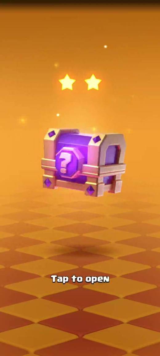
Four taps to open a chest
A chest, two stars, three '?' slots, 'Tap to open'. Four taps before the card appears.
Meant to feelHere is your reward.
Actually feels“Two stars. Three things. Come on.”
Given at once it is a number. Given in stages it is an event.
Cart and checkout
Every screen between the basket and the tap that takes the money.
We audit an app by opening it the way a person would and recording every screen on the way through: what is on it, what it asks of them, what it costs or earns them, and the established principle behind that. 308 of those screens, across 38 apps, were the cart and the checkout. Where the same answer kept coming back we wrote it down as a rule, and kept the screen it came from. These are 11 of them.
What they chose comes before what you want to sell.
WhatThe items, then the bill, then the pay button — recommendations, deals and cross-sells below the bill or not at all.
WhyA cart is the user's list; three screens of store between one item and its bill is the app putting itself between the user and their own decision.
Cognitive LoadChoice OverloadExampleOwnly: "Proceed to Pay · ₹390.50", matching "Total Payable ₹390.50" directly above it, with nothing between.
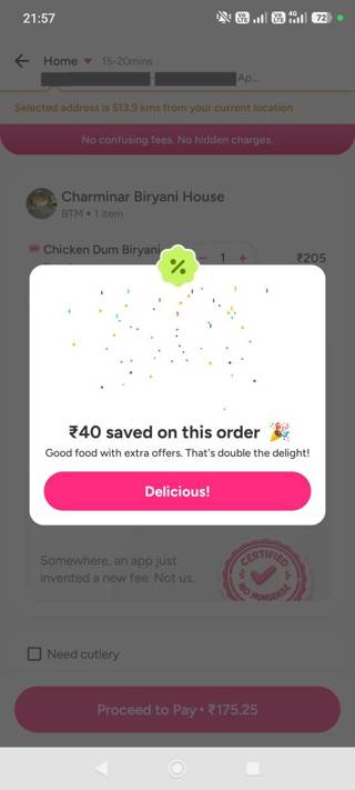 OwnlyWorks'Proceed to Pay • ₹390.50', matching 'Total Payable ₹390.50' above
How others did it 5
The commit button says the amount, and nothing else is heavier.
What"Pay ₹612" as the one filled button; every other control lighter than it.
WhyThe heaviest button is the one that gets tapped; if that is Buy Now over Add to Cart, or Join Club over Continue, the app has made the user's decision.
SalienceDefault EffectExampleZepto: "Pay Cash/UPI" filled, "Pay Online" outlined — two real choices, one obviously primary.
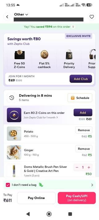 ZeptoWorks'Pay Cash/UPI (on delivery)' as the filled pink button and 'Pay Online' as an outline button beside it
How others did it 6
Something stands before the irreversible tap.
WhatA slide, a greyed button until a method is chosen, a Continue that waits for the step — never a full-colour Continue beside "to be selected".
WhyOne accidental tap on a live button is an order, a charge and a support call; a slide costs half a second.
Error PreventionExampleInstamart: "Slide to Pay ₹212" rather than a tap.
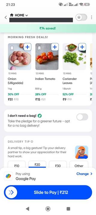 InstamartWorks'Slide to Pay ₹212' rather than a tap
How others did it 4
8 more rules for this one moment.
Each with what to do, why it works, the principles behind it and the screen it came from.
Open with a keySteal this
the screens that get it right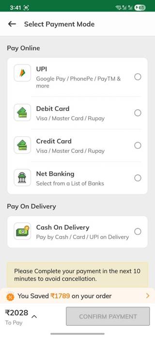
'CONFIRM PAYMENT' greyed until you pick a method
payment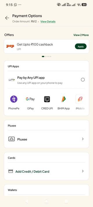
The radio button beside 'Pay by Any UPI app' is empty.
paymentDon't ship this
the screens that prove the cost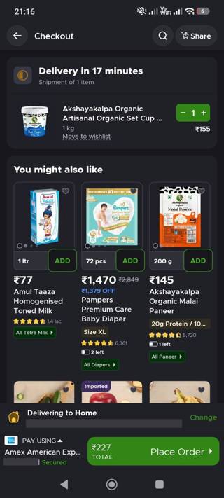
One item, then three screens of store before the bill
checkout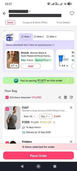
A DEAL 1 / DEAL 2 / DEAL 3 tabbed carousel — 'Items unlocked!
cartThirteen other moments — onboarding, paywalls, cancellation, tipping — are written the same way in the library.
eight screens of 1,348, across 60 audits. A key opens the rest — and lets you ask questions of them inside Claude, Cursor or ChatGPT.
See the plans Ask one free question